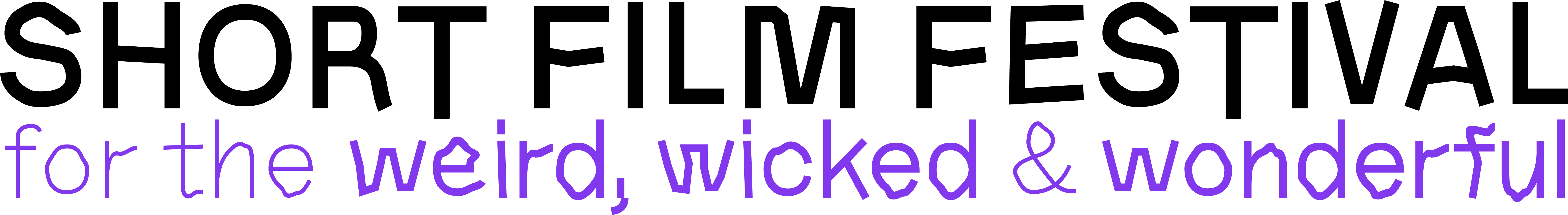
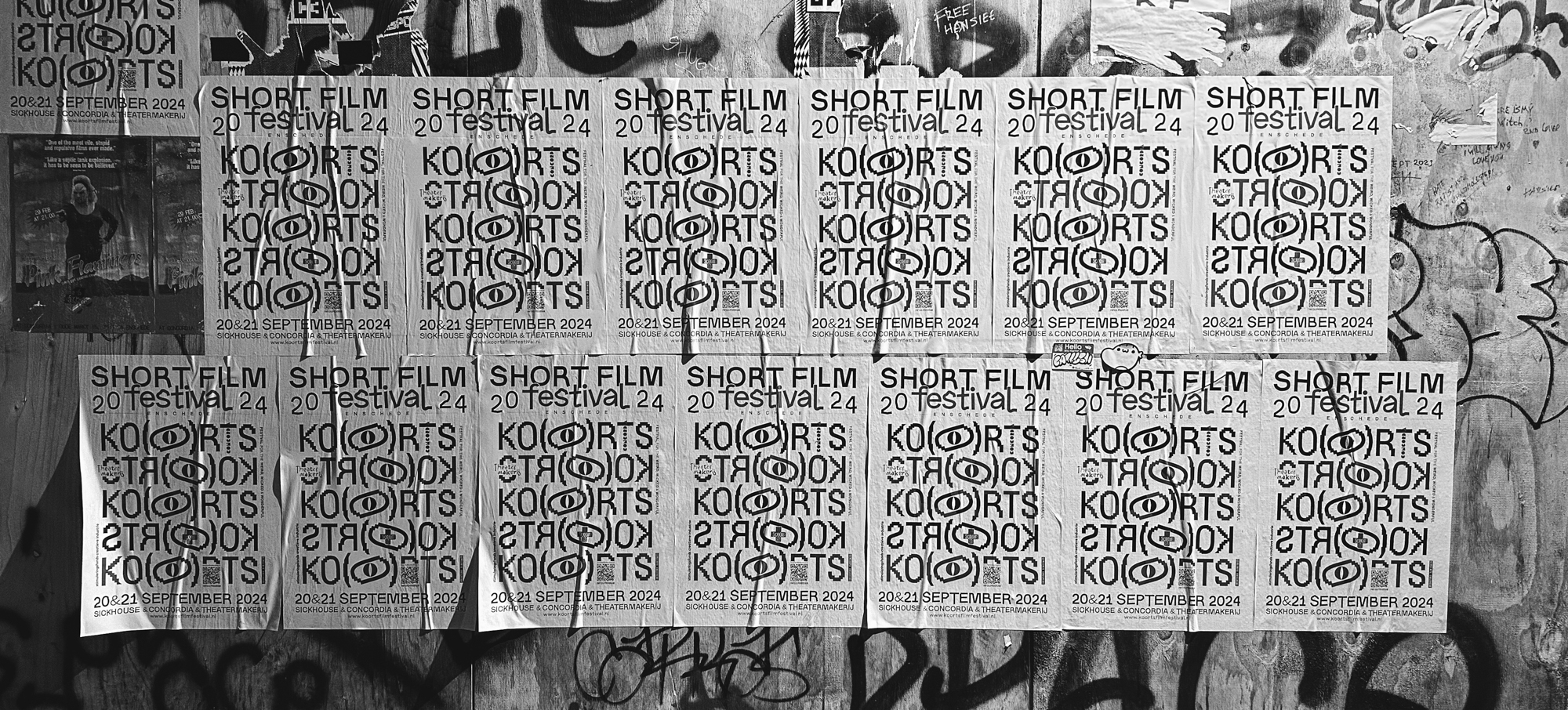
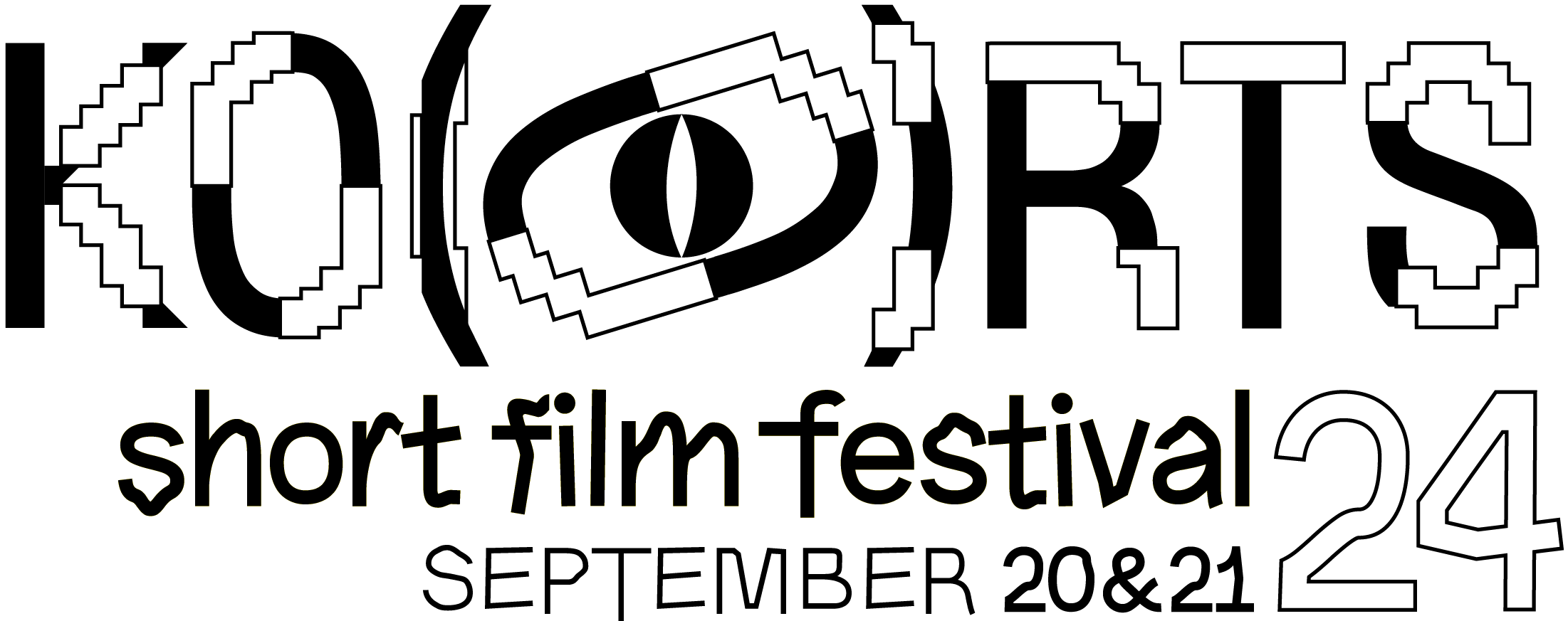
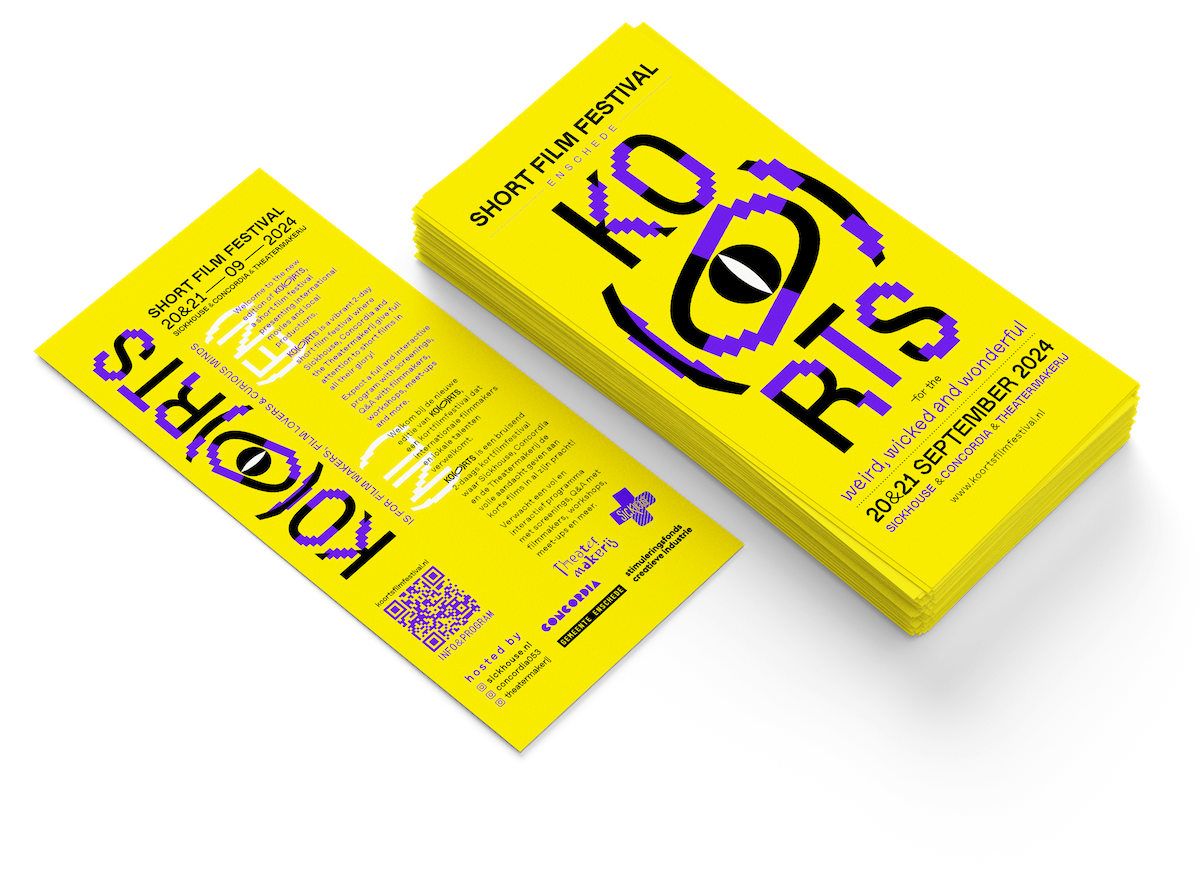
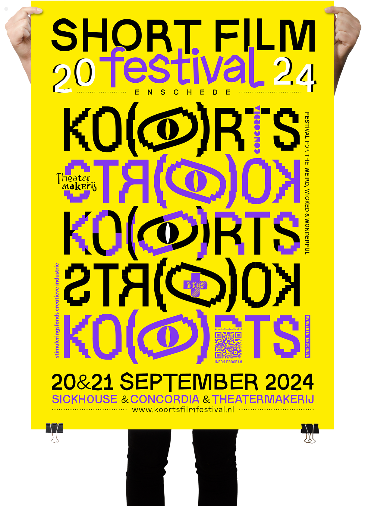
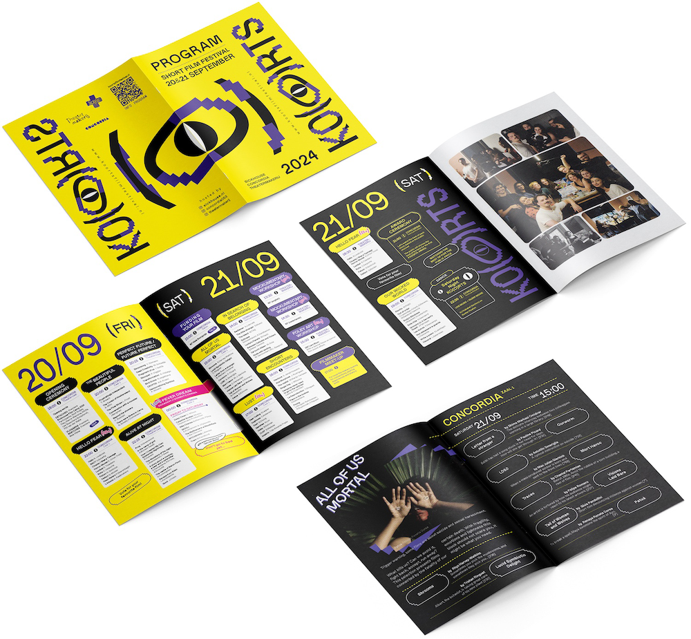
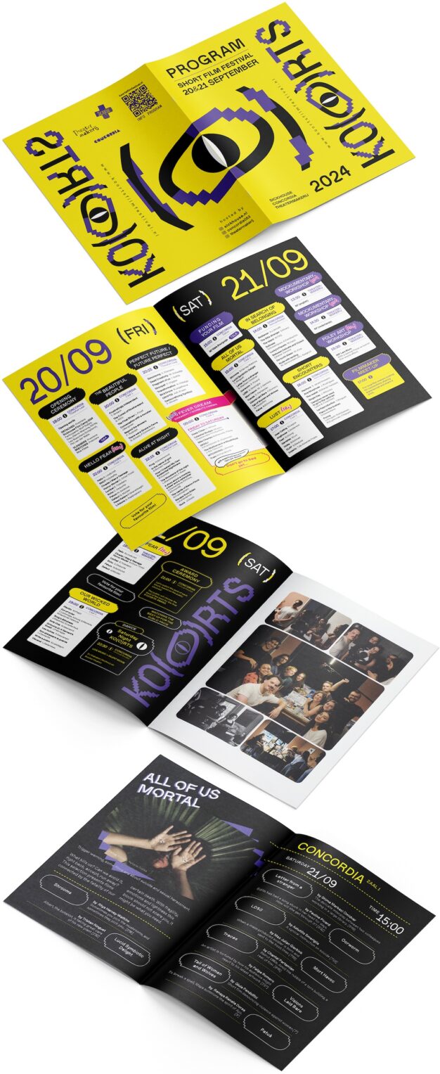
I was asked to develop a playful but clear visual identity for KO(O)RTS, a vibrant short film festival in Enschede by Sickhouse in cooperation with Concordia and Theatermakerij. It includes posters, flyers, flags, stickers, program booklet as well as templates for social media communication and a website.
KO(O)RTS explores a wide range of topics, from dark humor and horror, human desires and intimacy, to social critiques and speculative futures shaped by technology. It also delves into personal and societal struggles, including mortality and the search for identity and belonging.
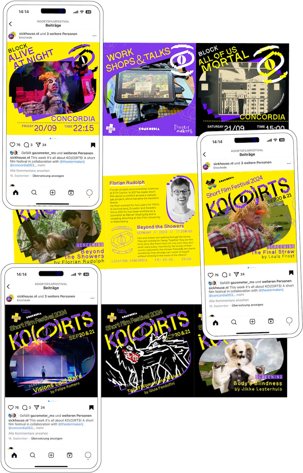
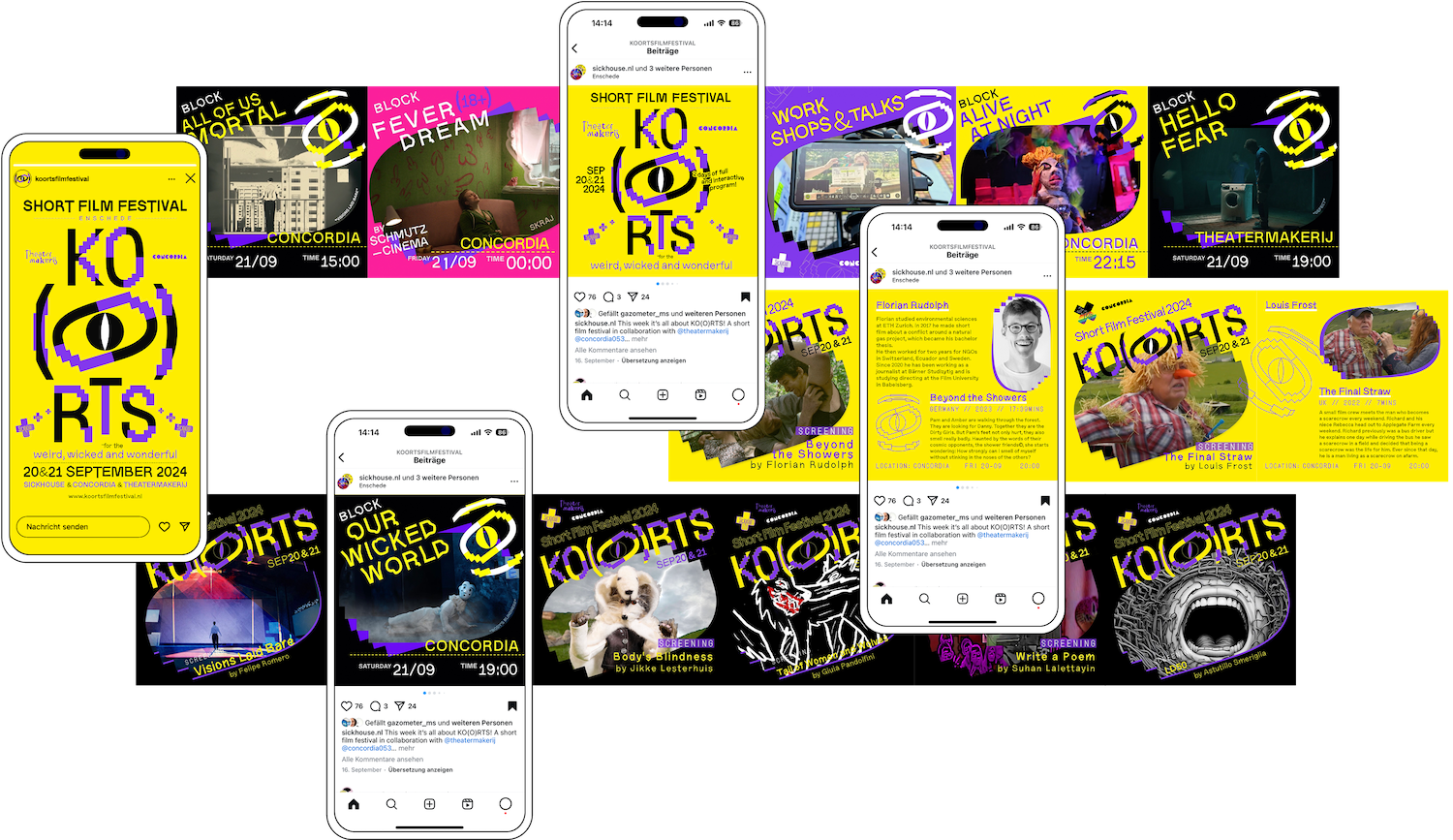
The screenings are organized into thematic blocks featuring a carefully curated selection of films from over a thousand international submissions.
With a mix of genres like horror, documentary, arthouse and avant-garde, KO(O)RTS provokes thought and emotions while celebrating diverse, eccentric diy-cinema from international and local film makers.
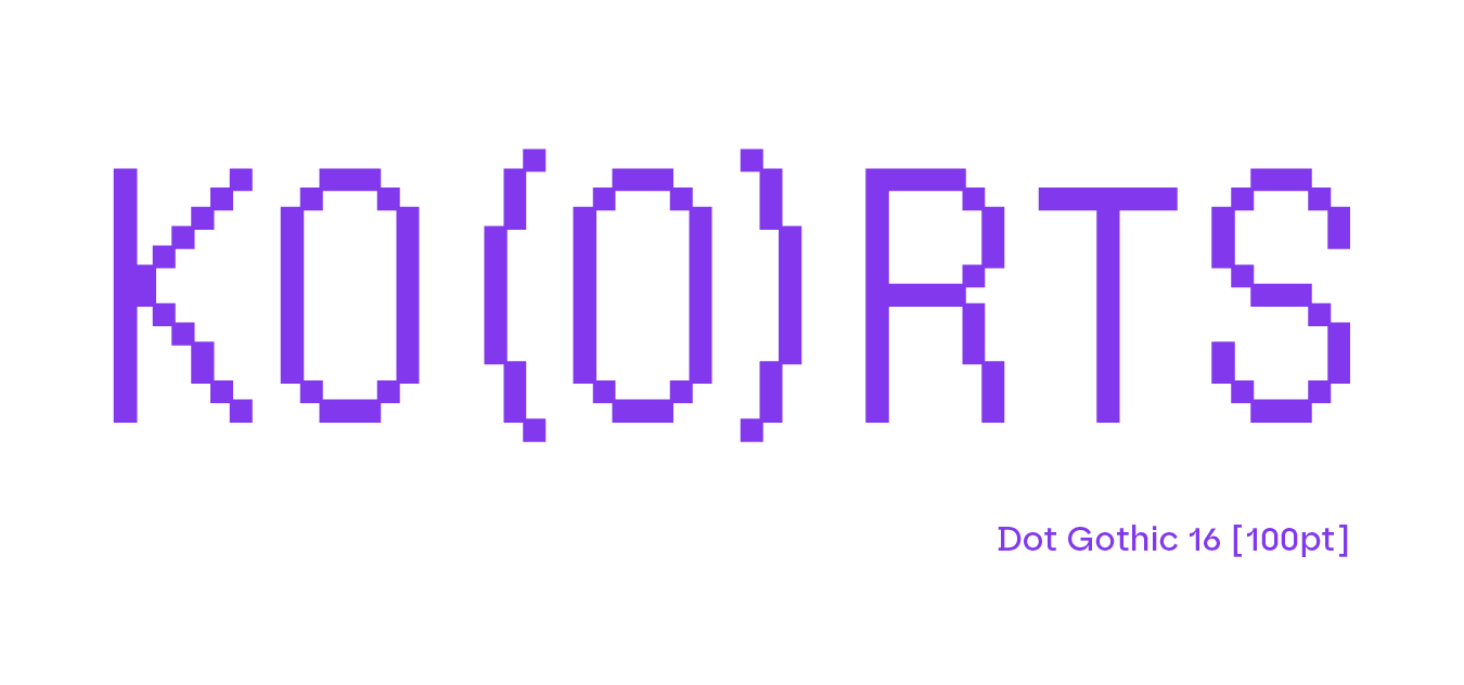
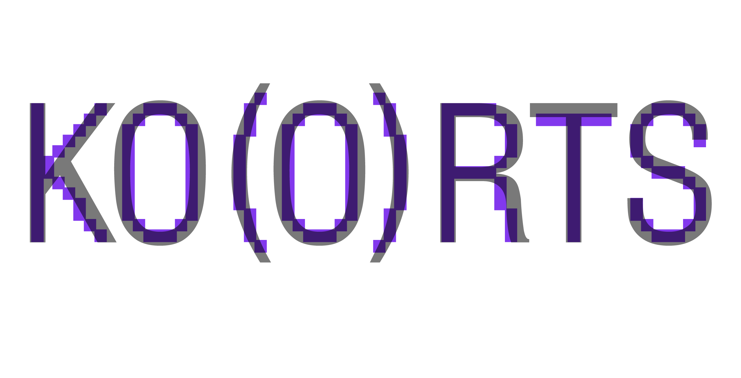
Dot Gothic 16 is the corporate font of SICKHOUSE, which gives gothic letters a 16-bit aesthetic.
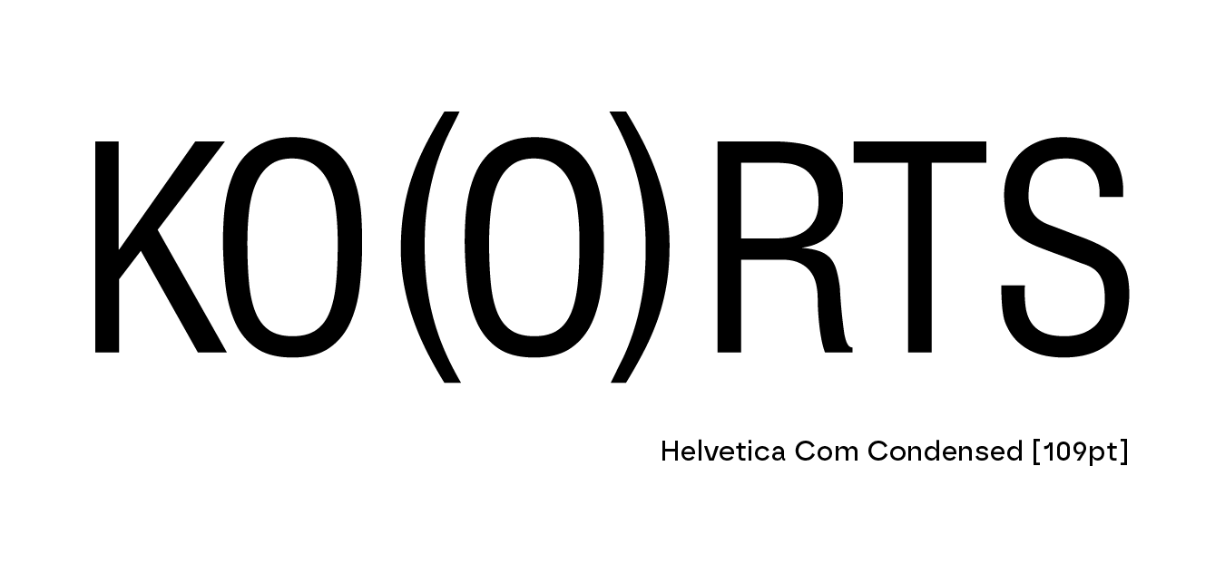
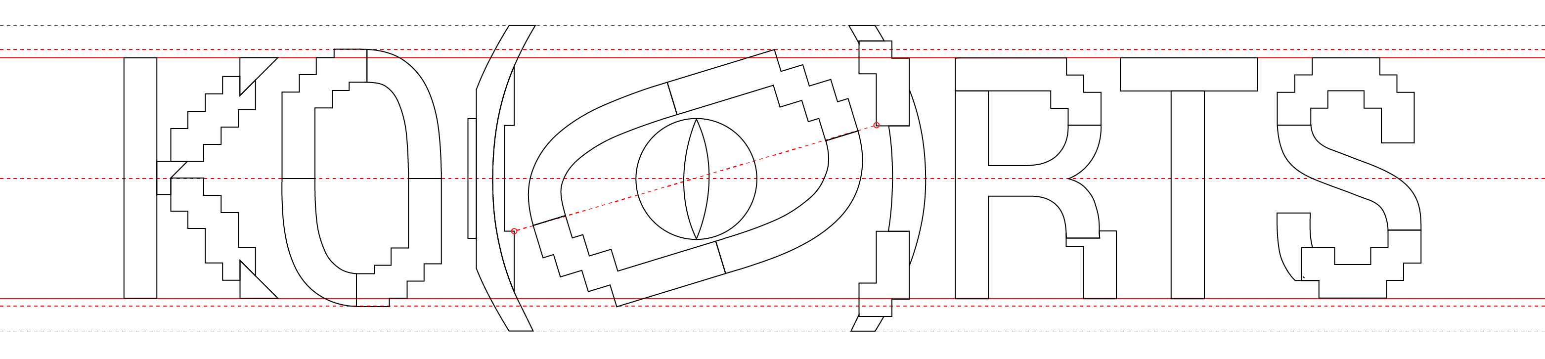
The search for the original typeface, that was possibly used as a template in the design of Dot Gothic 16, led to Helvetica Condensed.
Both typefaces layered.
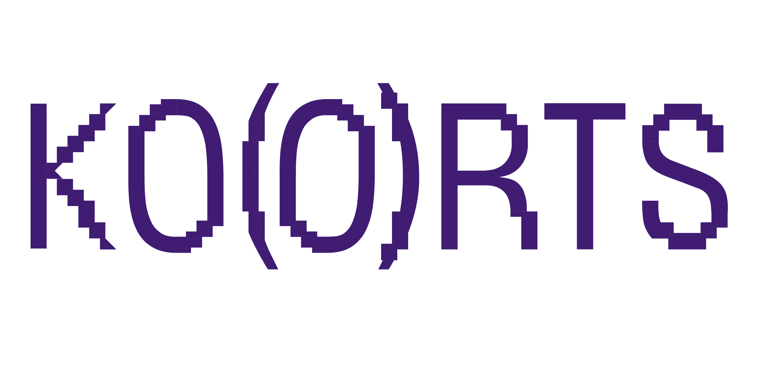
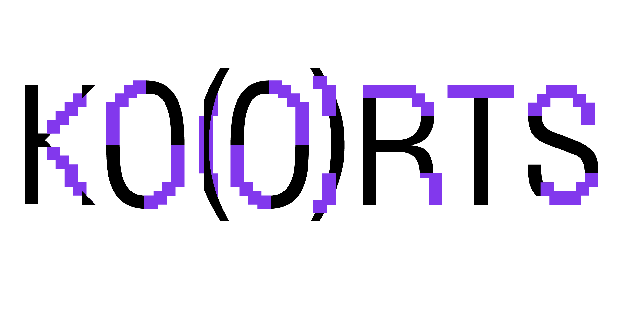
The two typefaces were then combined to create a unique letter formation.
The division of the letters is based on areas of similar width. Those parts that include characteristic features of one font were adopted.
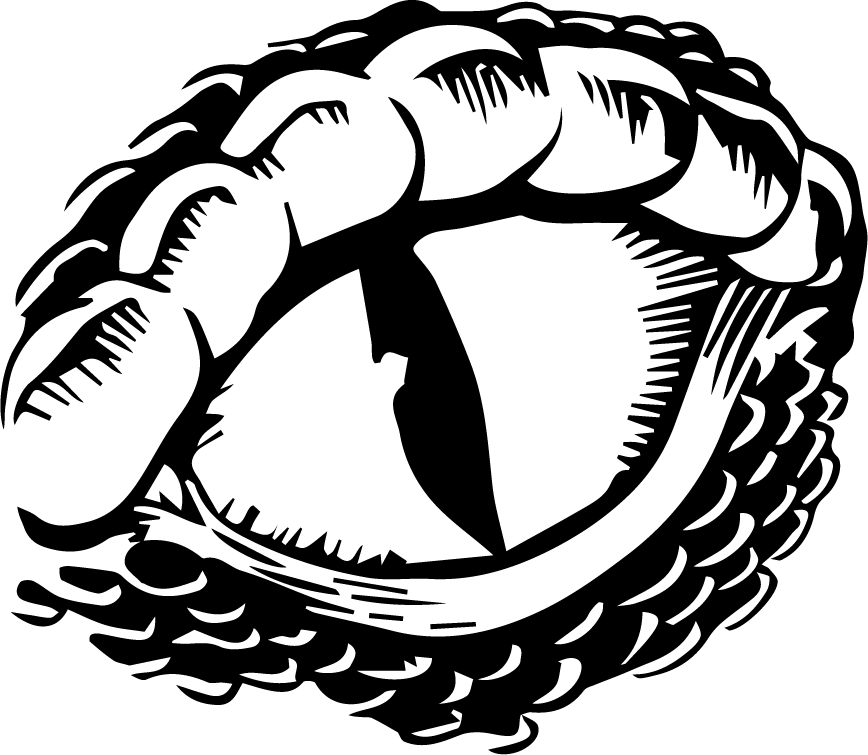
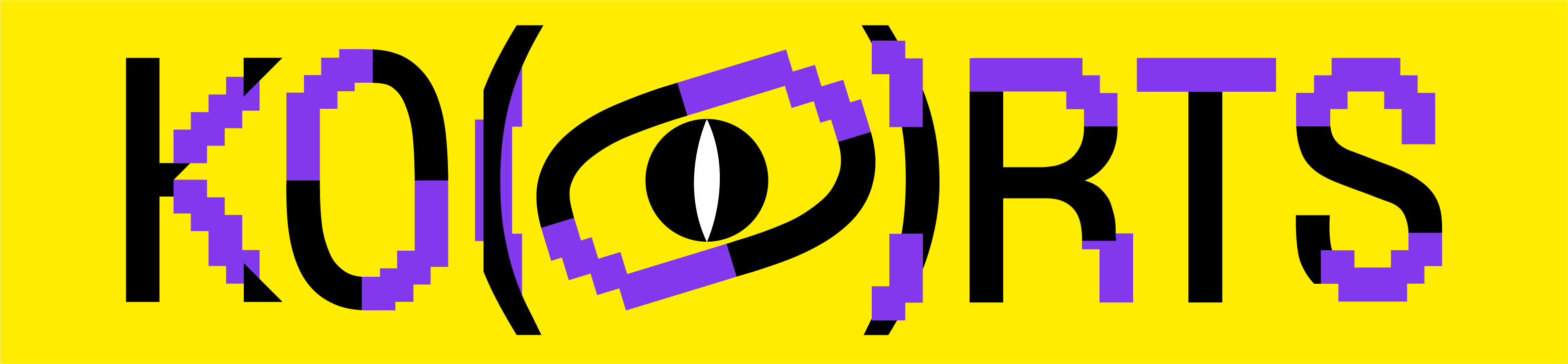
This raptile icon is part of the former logo and should somehow come up again.
Using only the typographic elements of these typefaces is a wonderful challenge.
In order to create the outer edge of the eye only from typographic elements, the letters needed to be a bit thicker to exactly match its weight.
With the spacing between the eye ball and the outer edge being a bit too small the entire thing appears both brutalist and fragile.
The square pixels are rotated with the eye at an unusual angle of 17°, which corresponds to the former height of the O. This is a new central point, a middle finger, so to speak, to the fixed pixel grid system. Isolated from the letters, it is still easy to recognize and can be used well on different media.
The eye is carefully held in balance by the brackets that are in fact everything but symmetric. The pupil circle in the middle is held tight like an intimate treasure.
Seismic is an experimental variable typeface that is eccentric in it’s own way without competing too much. The seamless destruction of the letters is matching the experimental typo of KO(O)RTS as only parts of the letters get affected and the rest stays untouched.